The remaining letters in the logo are slightly curved inward, creating an engaging visual effect reminiscent of a captivating wave of energy. This effect gives the impression that users are enthusiastically and delightfully savoring the juice.
Churt – Juice & smoothie
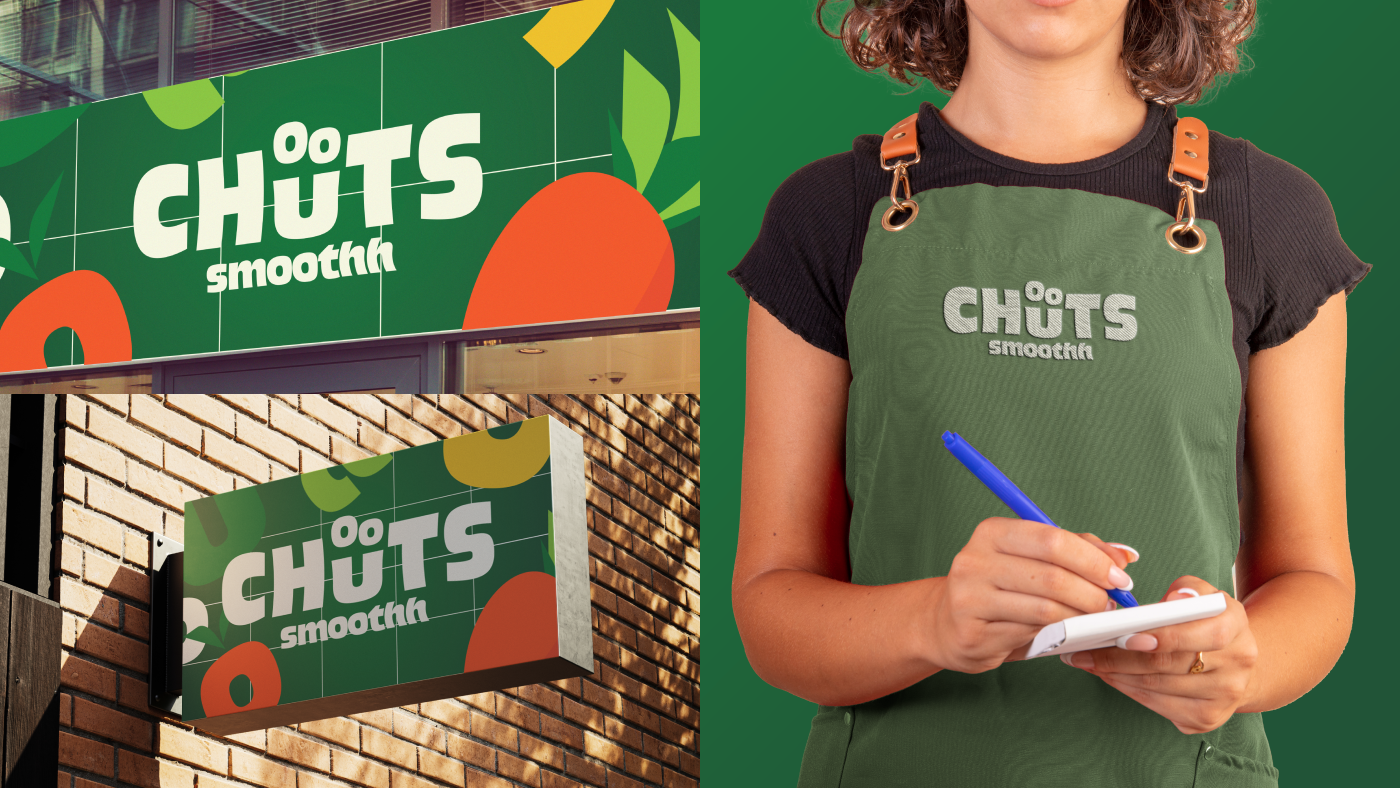
Logo Design of Chuts
Chuts, a modern fruit juice brand, proudly presents a unique logo design inspired by the word “Juice” in English. The standout feature is the “U” shaped like a smiling face, symbolizing the youthful energy and joy that Chuts aims to convey.
The overall design of the Chuts logo is not only aesthetically pleasing but also clearly communicates the brand’s message: youthful, dynamic, and full of life. Every time you look at the logo, you will feel the freshness and joy from the pure fruit juices that Chuts brings.